Doctor Who@50: Visual Vortex
An on-going Sci-Fi Bulletin series of thematic essays exploring the icons of Doctor Who during its 50th year… Visual Vortex: Regenerating the Title Sequence Viewers couldn’t have known what to […]


An on-going Sci-Fi Bulletin series of thematic essays exploring the icons of Doctor Who during its 50th year… Visual Vortex: Regenerating the Title Sequence Viewers couldn’t have known what to […]
An on-going Sci-Fi Bulletin series of thematic essays exploring the icons of Doctor Who during its 50th year…
Visual Vortex: Regenerating the Title Sequence
Viewers couldn’t have known what to expect. Following the sombre news of President Kennedy’s assassination that had dominated the news on BBC television on the afternoon of 23 November 1963, the next programme would have been a complete shock to the system.
Starting with a strong hissing sound, like alien breathing, over a relentless rhythmic underpinning, Ron Grainer and Delia Derbyshire’s theme tune played out over a starting set of visuals unlike anything else before or since on British television.
 A white line shoots up the middle of a black screen, ghosting and splitting apart to form a pulsing cloudscape that seems to rush out from the screen straight at the viewer, as if absorbing them into the new world this new programme was about to present. All the while the “dum-de-dum” rhythm pulses along with the white mass on the screen. The hissing breath sounds return as the clouds form the words DOCTOR WHO, at which point the theme plunges into a declarative “woo-woo”, with the programme’s strange title text disappearing backwards into the mysterious cloudscape that continues to pulse forward. The rhythm continues over the foggy opening scenes of An Unearthly Child as a policeman begins to investigate I.M. Foreman’s yard…
Most television title sequences of the 1960s incorporated some idea of the setting (a motel, a factory, the streets of London) and a guide to the type of characters the show features (cops, doctors, private investigators), perhaps conveying something of their history or personal quirks, and closing with the names of the stars over nicely composed shots of their faces. Doctor Who had none of that well-established televisual grammar. Instead, it plunged the viewer into a strange world of the unknown through an abstract journey to… Where? When? Each week would be different, and viewers never knew where they might be taken.
BBC graphic designer Bernard Lodge had been charged with creating the other-worldly visuals that would introduce audiences to the universe of Doctor Who in 1963. Lodge had joined the BBC in 1959 after leaving the Royal College of Art. He had an almost impossible task: to somehow briefly represent a brand new TV show whose lead characters could travel anywhere in time and space, from ancient history to the far future, from alien worlds to far flung space-stations.
Discussions between Lambert and Lodge settled on a motif of mystery as key to solving the problem. The show’s associate producer Mervyn Pinfield suggested Lodge should investigate the phenomenon of “howl-around”, the feedback patterns produced when a camera was pointed at its own monitor. In black and white television this produced abstract patterns of light and dark that could be changed by manipulating the angle and distance of the camera in relation to the monitor.
BBC technician Ben Palmer had previously used the technique to create dream-like visuals for the drama Amahl and the Night Visitors, broadcast in 1951. Palmer’s test footage was recovered from the BBC archive, viewed by Lambert and Lodge and used as the inspiration to create something similar for Doctor Who. Lambert only offered one direct instruction to Lodge: the titles must feature the show’s name, Doctor Who, incorporated somehow.
Lodge shot his first test footage on 20 August 1963 with cameramen Hugh Sheppard and Norman Taylor (both of whom had some claim to contributing to the development of the “howl-around” technique—each was paid a “bonus” of £25 for their work), with only three months until the series’ first episode was due to air. While the “howl-around” patterns themselves were fairly simple to create, however incorporating the text of the show’s simple logo with them proved problematic.
“What I didn’t realize,” said Lodge later, “was that the simple shape of the words, the two lines of fairly symmetrical type, would actually generate its own feedback pattern.” The opening seconds of the sequence—the white line shooting up the centre of the screen—was lifted directly from Palmer’s 1951 test footage, the rest of the “cloud” footage was from feedback created by Lodge based around the text of the logo and by shining a pen torch into the camera while it filmed the image it was itself generating on the monitor. Although the feedback around the text momentarily made the title of the show appear to be DOCTOR OHO, the result was deemed a success.
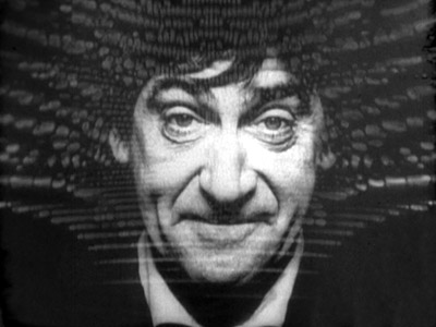 Lodge would continue to work on the series titles up until 1980. For each revision he continued to apply new technological techniques and new approaches, all the while maintaining the abstract nature of the show’s distinctive visual signature. In 1967, Lodge created a more dynamic “howl-around” effect and introduced a still picture of the new Doctor, Patrick Troughton, into the titles. The use of the Doctor’s face would continue until the end of the show in 1989 (and was reintroduced at Christmas 2012). The Doctor Who logo font was also revised to a serif type.
 An entirely new title sequence—and a new series logo (adapted for the 1996 TV movie and for the show’s 40th anniversary)—was created for the introduction of colour to the series in 1970. A red-hued tunnel now featured, adapting the “howl-around” technique to colour photography, with the series logo moving toward the viewer rather than away as before.
 For Jon Pertwee’s final season in 1974, there was another new logo—the much-loved “diamond” style. For the completely new titles, Lodge adopted “slit-scan”, a technique used in the climactic abstract “stargate” scenes of 2001: A Space Odyssey (1968). The Doctor’s face now appeared from within a star cloud or nebula effect, before his entire figure receded backwards into the vortex. This mixed streaking stars with the now well-established “time vortex” graphics, a style that continued throughout the Tom Baker years (with the addition of the TARDIS, as well as Baker’s face and scarf combo), until incoming producer John Nathan-Turner completely overhauled the theme music (which had also continued to evolve) and title sequence for the show.
 A more space-based look was adopted in 1980, with a graphic starfield, while the Doctor’s face (Baker, Peter Davison, then Colin Baker) was even more prominent. This showed the all-pervasive influence of movies like Star Wars (1977) and its imitators: space was prioritized over the more abstract concepts from the past. An update of the Doctor’s face was added (Baker had noticeably aged between 1974 and 1980), and a new “handlebar” logo, in the then in-vogue “joined up” Star Wars style was featured. The combination was still different from most other television title sequences, which had not dramatically evolved in the meantime, but lacked some of the abstract strangeness that had come to be one of Doctor Who’s early key graphic signatures.
With Tom Baker’s departure, the titles were regularly refreshed rather than redesigned, initially to include Davison’s face, then with the addition of colour streaks and rainbow hues for Colin Baker’s colourful debut. Although this added something of the feel of the time tunnel vortex that had been missing for several years, the fact that Baker’s Doctor was inanely grinning out of the titles gave them the feel of a light entertainment show rather than a mysterious journey through time and space, complete with accompanying danger.
 The arrival of Sylvester McCoy saw a fully computer animated title sequence used for the first time, incorporating explosions, asteroids, images of a galaxy, and the TARDIS (trapped in some kind of bubble). Produced by CAL Video and designed by Oliver Elmes, it was groundbreaking at the time, although progress in TV graphics quickly left it behind and rather dated looking by the time of the show’s cancellation in 1989. The less said about the nasty “game show” logo the better. By this point in the show’s history, not only was the mystery surrounding the central character all but dispelled, so was any attempt at incorporating anything mysterious or abstract into the graphic visual identity adopted by the show. It was more “light ent” than ever, and a rather literal interpretation of the TARDIS’s potential journeys.
 The 1996 TV movie starring Paul McGann adopted a more stately title sequence featuring the TARDIS flying through space accompanied by a slower orchestral version of the theme. There was an effort to combine most of the successful elements from the past, including the more recent starfield, the original abstract clouds, a hint of the “slit-scan” time tunnel vortex, and even McCoy’s errant asteroids. The use of the much-loved early-1970s logo (this time in rotating CGI), with the arched H in WHO, was another “kiss to the past”. These American-style titles appeared in a television environment dominated by Star Trek spin-offs (Deep Space Nine, Voyager), new shows like Space: Above and Beyond, and Babylon 5, each of which had titles emphasizing space as their location. Time travel and dimension hopping shows like Quantum Leap and Sliders adopted the standard clips and “saga sell” narrative intros common to American series from the 1950s to the present. The only contemporary show that came close to capturing Doctor Who‘s sense of mystery in its title sequence was The X-Files, with its haunting theme and titles made up of graphic stills of unexplained events.
 The first five years of the revived Doctor Who (featuring Christopher Eccleston and David Tennant) saw the TARDIS flying through a basic blue-red “time vortex” tunnel effect matched with Murray Gold’s continually revised versions of the classic theme. This was a “back to basics” approach, a CGI recreation of the kind of 1970s “slit-scan” time tunnel effect that most viewers would have associated with Doctor Who, and it completely ignored the more prosaic 1980s starfield-style titles. The new logo, however, was a simple text element mounted on a “flying lozenge” supposedly designed to take advantage of modern wide-screen TVs. Disparagingly known as the “taxi light” logo, it never really won the affection of fans. As an attempt to recapture Doctor Who’s lost audience, however, these titles worked well, both in resisting the temptation to produce something more televisually conventional and in sticking to Doctor Who’s unique contribution to television graphic history.
 The Matt Smith years have seen a variety of approaches, reintroducing the idea of “clouds” to the titles, while experimenting with fonts and graphics, before combining many of the classic elements of various titles for the 50th anniversary year. The “smoke tunnel” from 2010 was an attempt to recapture the mysterious “clouds” from 1963, although it was overwhelmed by the lightning strike effects and sounds built into the theme. The incorporation of the “DW” device and the TARDIS into the Doctor Who logo was a clever innovation, even if it was redolent of the triumph of “branding” over creativity for its own sake.
 The latest titles for the show’s 50th anniversary year are a deliberate and triumphant celebration of everything that has gone before. Presented as a journey through time and space, the titles that debuted on The Snowmen incorporated the TARDIS, the clouds and galaxies of the Hartnell and McCoy titles, planets and nebulae in a swiftly spinning tumble, the Doctor’s face forming from the clouds (like Troughton’s—Matt Smith’s inspiration), and the logo breaking apart to unleash an up-to-date CGI version of the classic Tom Baker slit-scan time tunnel effect (albeit in red hues). It’s an effective encapsulation of the show’s potential, capturing perhaps for the first time the true time and space traversing nature of Doctor Who.
Next Time: The first companions
